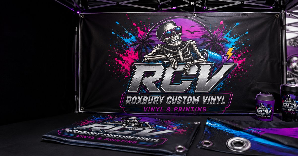
Event banners are one of the most common things we print, and also one of the easiest to get wrong — not because of print quality, but because of decisions made before the file ever reaches us. A banner that looks perfect on a screen can end up unreadable once it's actually hanging where it's supposed to be seen.
Size Relative to Viewing Distance Matters Most
A good rule of thumb: text should be roughly one inch tall for every 10 feet of intended viewing distance. A banner people will walk right past on a sidewalk needs different sizing than one meant to be read from a car driving by at 35 miles an hour. Before we even talk design, we ask where the banner is going and how far away people will typically be — that answer shapes everything else.
Placement Changes What Design Works
A banner hung high needs simpler, bolder content than one at eye level, since detail and small text simply disappear from a distance and an angle. A banner behind a check-in table at eye level can carry more information — a schedule, a sponsor list, contact details — while a banner mounted above a stage or across a building facade needs to communicate its message in about two seconds flat: a name, a logo, maybe one short line.
The Most Common Mistake: Designing at the Wrong Scale
A logo that looks fine on a laptop can look pixelated blown up to banner size, since screen resolution and print resolution aren't the same thing. This is the single most common issue we catch before printing — a file that was never built at the actual output size, or built from a low-resolution source image that simply can't scale up cleanly. We check for this on every banner order before it goes to print, not after.
Why We Ask Questions Most Print Shops Skip
A lot of banner printers just take your file, print exactly what you send, and let you find out on event day whether it actually works. We do it differently. Because we're a small, local, veteran-owned shop, we take the time to ask where it's hanging, how big it needs to be, and who's going to be reading it — the same way we'd want someone to ask us if the roles were reversed. That upfront conversation is the difference between a banner that just prints correctly and one that actually does its job on the day that matters.
Tell us the size, where it'll hang, and how far away people will typically be standing, and we'll make sure it's legible where it counts.
Planning guide
How to Plan a Banner That Can Be Read in Real Life
A banner is not a large flyer. People usually see it while walking, driving, entering a room, or looking across a crowded field. Successful banner design starts with viewing conditions: how far away the reader will be, how quickly they will pass, what may block the banner, and what single action the message should create.
Build a clear information hierarchy
The most important message should be the largest element. A business name, event name, or short headline normally comes first; the date, location, phone number, or web address comes second. Details that require a paragraph belong on a handout or webpage, not on a roadside banner. Strong contrast and generous open space usually improve readability more than adding another graphic.
Choose size from distance—not from the available artwork
Small indoor registration banners can be effective because viewers stand nearby. A fence banner, stage backdrop, or roadside sign needs larger lettering and fewer words. Before ordering, measure the actual installation area and note rails, posts, doors, landscaping, parked vehicles, and crowd lines that could cover important content.
Plan for mounting and weather
Grommets, hems, pole pockets, and wind-management options solve different installation problems. Attachment points should distribute tension rather than force the entire load onto one corner. Outdoor banners also need safe placement and periodic inspection; no printed material should be installed where it blocks visibility, creates a hazard, or violates venue or municipal rules.
What to send RCV: the installation measurements, a photo of the location, expected viewing distance, indoor or outdoor use, event date, exact wording, logo files, and any venue requirements. We can then size the artwork for the real setting.
Artwork Quality at Banner Scale
A logo that looks acceptable on a phone screen may reveal jagged edges when enlarged several feet wide. Vector artwork is ideal for logos and lettering because it can scale cleanly. High-resolution raster images can also work when their original pixel dimensions are sufficient. Taking a tiny image from a website and increasing its resolution does not recreate missing detail.
Roxbury Custom Vinyl checks legibility, contrast, margins, image quality, and likely installation issues before production. That local review is valuable because it catches expensive problems while they are still easy to change.